The Story
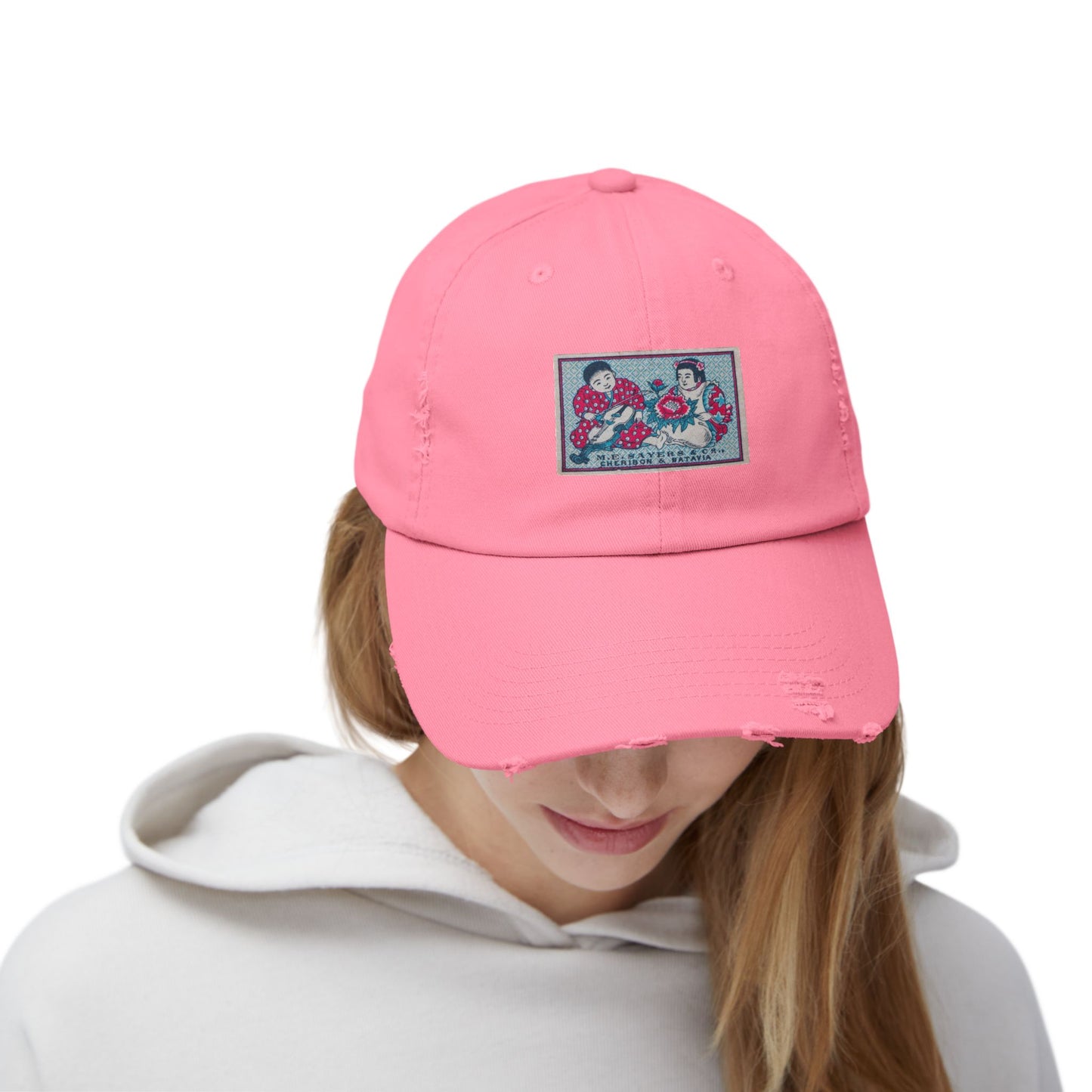
This is one of the most charming labels in the archive, and on the front of a distressed cap it brings real warmth at a small scale. Two children sit facing one another, each in a red kimono patterned with white polka dots, one holding a violin and bow, the other beside a large blooming peony in deep red and green. The ground behind them is a soft patterned blue, finely worked in a diaper lattice, and the whole scene has the tender, slightly formal sweetness of an old greeting card. A panel at the base reads "M.E. Sayers & Co., Cheribon & Batavia," naming the trading house and its two ports on the island of Java.
Cheribon, now Cirebon, and Batavia, now Jakarta, were major trading centers in the Dutch East Indies, and the label was produced by a Japanese manufacturer for export to that market. The imagery is a fascinating cultural blend: the children and the peony draw on East Asian decorative tradition, while the European violin and the Dutch colonial trade names speak to the complicated web of commerce that moved these little boxes across the world. Labels like this one, aimed at the Indonesian archipelago through Dutch trading houses, are among the most culturally layered in the entire export catalogue.
On the distressed cap the label sits crisp and bright on the front panel, the red kimonos, blue ground and red peony holding their detail against the soft worn-in twill.
Who Is It For
This cap is for someone who wants a tender, characterful image with a genuinely intricate history behind it. They are drawn to the two children, to the violin and the peony, to the soft patterned blue, and to the layered story of a Japanese-made label traded into the Dutch East Indies. The distressed finish gives it an easy, lived-in feel, and the scene rewards anyone who looks closely. It pairs as naturally with a worn tee as it does with something sharper.
Available Colors
Black: On black the soft blue ground and red kimonos glow with real contrast, the whole tender scene lifting off the dark cap. Bold and characterful.
Burnt Orange: The warm burnt orange picks up the reds in the label for an earthy, autumnal pairing.
Dashing Red: A red cap echoes the kimonos and peony, pulling the warm tones forward against the blue ground.
Light Olive: The muted olive sets off the soft blue and red with a vintage, gently faded feel.
Nickel: The soft grey nickel is a neutral, contemporary ground that lets the label's blue and red read at full strength.
Scotland Blue: The deep blue picks up the patterned blue ground of the label for a rich tonal effect.
Stone: The pale stone is a clean, understated ground that frames the label like a gallery mat, all attention on the two children.
True Pink: The soft pink plays sweetly off the red kimonos and peony, leaning into the label's tender charm.
About the Collection
Every design in the Ichinichi Collection is sourced from a personal archive of original Japanese matchbox labels spanning 1880 to 1940. The M.E. Sayers label was produced by a Japanese manufacturer for export to the Dutch East Indies through trading houses at Cheribon and Batavia on Java. Its blend of East Asian children and peony imagery with a European violin and Dutch colonial trade names makes it one of the most culturally layered labels in the archive.
Product Details
Material: 100% cotton twill. Fit: Low profile, adjustable. Closure: Self-fabric hideaway strap with metal D-ring slider. Label: Sewn-in. Print: Direct to Film (DTF) on front panel. Note: Due to the special distress finishing process, distress pattern and color may vary slightly from cap to cap, part of the character of each piece.