The Story
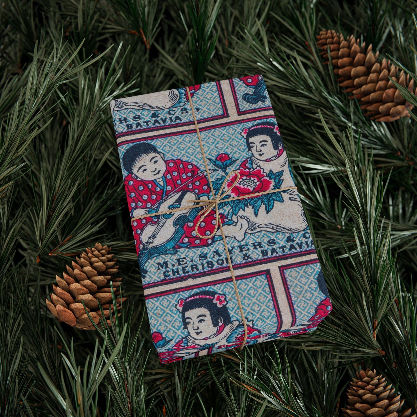
This label is gentle where so many export designs are bold, and that softness is exactly what makes it memorable. Two children sit close together, both in red kimonos patterned with white polka dots, one leaning in toward a large blooming peony rendered in deep pink and teal, the other turned slightly away holding a small flower. Their faces are round and serene, hair dark and neatly styled, the whole scene set against a finely patterned pale blue ground. At the base, in small clear lettering, the label reads "M.E. Sayers & Co., Cheribon & Batavia," naming the trading firm and the two Javanese port cities it operated from: Cheribon, now Cirebon, on the north coast, and Batavia, the colonial capital now known as Jakarta.
M.E. Sayers & Co. was a trading company in the Dutch East Indies, and this label was almost certainly commissioned by the firm directly from a Japanese match manufacturer, a standard arrangement in the early twentieth century when colonial trading houses ordered custom-branded matches for their own distribution networks. The choice of two gentle children with a peony, a flower symbolising prosperity, honour and good fortune across East Asian cultures, was a soft and auspicious image, well suited to a consumer market and quite different in tone from the fierce animals and deities of other export runs.
As an all-over repeat on wrapping paper the label tiles into a tender, busy field of red, blue and pink, the rows of children and peonies reading almost like a vintage nursery textile. The QR code and white margin at the top and bottom edges are included as noted by the supplier.
Who Is It For
This paper suits someone with a feel for the gentler corners of trade history and a love of imagery that carries real warmth. They are drawn to the children, to the peony, to the soft blue ground, and to the layered story of a Dutch trading firm in colonial Java ordering matches from a Japanese factory and wrapping the whole transaction in an image this tender. It is particularly well suited to gifts for new arrivals, for children, for anyone who would appreciate something quietly beautiful with a deep story behind it.
About the Collection
Every design in the Ichinichi Collection is sourced from a personal archive of original Japanese matchbox labels spanning 1880 to 1940. The M.E. Sayers & Co. label is one of the archive's Dutch East Indies pieces, a custom commission for a trading firm operating from Cheribon and Batavia in colonial Java. The tender scene of two children with a peony makes it one of the gentlest and most charming labels in the collection, and a quiet record of the commercial networks that linked Japan, the Netherlands and Southeast Asia in the early twentieth century.
Product Details
Material: 90gsm fine art paper. Sizes: 30 x 36 inches, 30 x 72 inches and 30 x 180 inches. Print: One-sided, high-definition. Finish: Matte or glossy. Delivered rolled. Note: Includes white spaces at top and bottom edges with a bar and QR code.